 I've made a lot of enhancements to the script since the time when I first released it. I will probably share the newest version of that script (which also features a changelog with Atom 1.0 feeds).
 Hari's Corner
Humour, comics, tech, law, software, reviews, essays, articles and HOWTOs intermingled with random philosophy now and thenA website which uses my script
Filed under:
Bits and Bytes by
Hari
Posted on Fri, Oct 26, 2007 at 09:33 IST (last updated: Wed, Jul 16, 2008 @ 20:46 IST)
 I've made a lot of enhancements to the script since the time when I first released it. I will probably share the newest version of that script (which also features a changelog with Atom 1.0 feeds).
 b2evolution 2.0.2 alpha released
Filed under:
Site management by
Hari
Posted on Mon, Oct 15, 2007 at 15:54 IST (last updated: Wed, Oct 29, 2008 @ 22:39 IST)

My web development toolkit
Filed under:
Software and Technology by
Hari
Posted on Wed, Oct 10, 2007 at 13:39 IST (last updated: Thu, May 7, 2009 @ 21:14 IST)
Platform: Linux, Apache, MySQL, PHP with firewall
On my Debian system, I've installed Apache 2.0 web server, along with MySQL and PHP 5. This makes for a fairly standard web setup and although my router acts as a firewall, I've also installed and configured guarddog which acts as an excellent graphical front-end to iptables, the Linux kernel firewall. This makes up a good "sandbox" setup which is great for development and local testing before uploading content to the web.Web editor of choice: Quanta Plus
Quanta Plus is an excellent web development editor for KDE. Optimized for PHP development with syntax highlighting, code auto-completion and function parameter tooltips, this resource is great for editing HTML, XHTML and CSS along with PHP and other code. I cannot imagine writing PHP code without this editor and it has served me well in editing, creating and optimizing my website offline. It has a large set of tools which automate creation of HTML forms and tables as well as a fully integrated style editor which allows you to create CSS in an integrated GUI environment. It has many more features which make life easier for developers, but I'll just say that this is one tool that every PHP programmer needs to check out before using commercial, proprietary web editors.Graphic designer: GIMP
GIMP is another tool I really over-use for creating cool web graphics. It has many scripts which make this easy, but I generally like to experiment with this tool to try out new effects. In fact, the current theme for this blog was designed using GIMP. Once again, for those who cannot paid, proprietary tools like Photoshop, GIMP is the way to go, particularly for web graphics design.Miscellaneous development aids
Here are a list of other programming tools which I find useful in my web development work.- MySQL Navigator - while the MySQL command line is the most flexible and powerful way of manipulating databases, sometimes you need a graphical tool just to examine and view table structures and contents. This is one such tool I found in the Debian repositories. Features include exporting/importing databases as well as running SQL queries on the server.
- KRegExpEditor - a KDE application which allows you to create regular expressions in a graphical, intuitive way. An excellent companion for all programmers, particular those who need to parse textual data in a powerful, flexible manner.
- KColorChooser - this is a KDE widget which is bundled along with the
kdegraphicspackage. What this makes easy is picking colours from anywhere on the desktop which is very handy when editing CSS files. - KDiff3 - a useful front-end to
diffandpatch, this allows me to easily compare two versions of the same file for changes/modifications. This is handy if you find the command linedifftools inconvenient. - rsync and ssh -
rsyncallows me to securely upload/sync files on my server (a much better, faster, safer alternative to FTP), while the OpenSSH client allows me to securely login to my user account on the remote server (access kindly provided by Drew).
GIMP tutorial - creating a Kubrick-like website theme
Filed under:
Tutorials and HOWTOs by
Hari
Posted on Mon, Oct 8, 2007 at 13:18 IST (last updated: Sun, May 10, 2009 @ 16:41 IST)
Step 1: Get a good header image
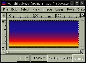 Open a good header graphic you want to use in GIMP. I've chosen a simple blend effect as a background image, but you can use cross-sections of good photos or any other background image which you think fits in well with your theme.
Click on a page number to continue the tutorial.
Step 2: Round the corners
Choose the menu option Script-Fu -> Decor -> Round Corners....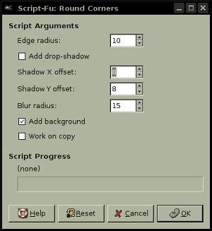 Disable Add drop shadow and Work on copy. Choose the radius as 10. If you prefer you can experiment with this value to get the effect you want.
Step 3: Add a border
Now create a white border around our header graphic. Choose Script-Fu -> Decor-> Add border...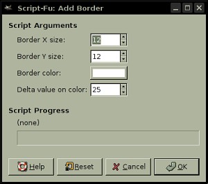 Make sure the border colour is white and ensure that the border width is slightly higher than the round radius value you chose earlier. This will allow you to "cookie-cut" the theme images from the base image we're creating.
Step 4: Flatten the image
Now your image should look like this (if your border isn't entirely white, fill the non-white regions with white). Flatten the image using the menu option Image -> Flatten image.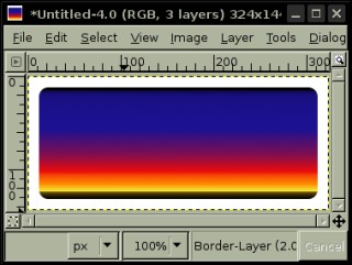 Your image should now appear like the one shown in the screenshot above.
Step 5: Create a shaded outer border
Now you need a shaded outer border which will enclose the header, the body and the footer images to use for your theme. Choose the menu option Script-Fu -> Decor -> Round Corners... once again.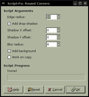 Let the shadow offset for x and y be 0 and choose a blur radius of 8 (you can experiment with this value to get different results). Adjust the background colour to whatever you want for your body background before you apply this script. Your image should now look like the one in the screenshot below.
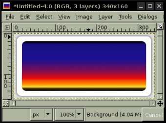 Fantastic, you now have the base image from which you can "cut out" your theme.
Step 6: Cookie-cutting the theme images
From the base image above, you can now cut out suitable images for header, body and footer for the theme to use. Here is an example (select the portion from the base image, use Edit -> Copy visible and paste the results into new files. Remove the inner image clippings from the content background and footer images. Here are the results from the above base image. Header image: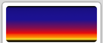 Content background image:
 Footer image:
 That's all.
Step 7: Relevant CSS attributes in style sheet
Assuming that theDIV IDs for header, content body and footer will be header, content and footer respectively. Make sure that you've also set the HTML BODY background attribute to the exact colour as the background colour used (grey, in this instance).
#header {
    background-image: url('result-header.png');
    background-repeat: no-repeat;
    width: 340px;
    height: 143px;
}
#content {
    background-image: url('result-content.png');
    background-repeat: repeat-y;
    width: 320px;
    padding: 10px;
}
#footer {
    background-image: url('result-footer.png');
    background-repeat: no-repeat;
    width: 340px;
    height: 45px;
}
Here's a sample screenshot of a website with a Kubrick-like web header. Much nicer than a plain header, isn't it? 
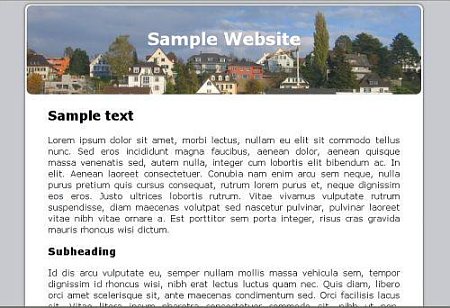 You should, of course, customize the above CSS code to ensure best results. Your theme is now ready to use.
 Where it all began
Filed under:
Bits and Bytes by
Hari
Posted on Sun, Oct 7, 2007 at 21:18 IST (last updated: Wed, Jul 16, 2008 @ 20:47 IST)
 As an event, I personally rate it as next in importance to the Big Bang itself.
  Almost makes me nostalgic to think of the days before blogging became the common man's platform of self-expression and Web 2.0 (ingenious version numbering scheme, don't you think?) the mantra of the Internet so on and so forth.
 Evolve your thinking
Filed under:
Life and Leisure by
Hari
Posted on Sun, Oct 7, 2007 at 19:43 IST (last updated: Wed, Jul 16, 2008 @ 21:12 IST)
 If you've read this fully, my apologies for the lecture (blame the Papa Hari University of Advanced Thinking and Logic). Regular programming will commence shortly
  )
)