Humour, comics, tech, law, software, reviews, essays, articles and HOWTOs intermingled with random philosophy now and then
Filed under:
Software and Technology by
Hari
Posted on Tue, May 26, 2009 at 08:52 IST (last updated: Tue, May 26, 2009 @ 09:03 IST)
Well, I finally upgraded to KDE 4 (4.2 from Debian testing repositories). It wasn't exactly a smooth upgrade. The standard dist-upgrade borked KDE because I think a few essential KDE 4 components weren't installed. It's a novel experience on Debian to find so many essential components broken, but the fix was reasonably painless and automated. Bearing in mind that KDE 4.2 is a big jump from 3.5, I think that it's excusable.
I then installed
fluxbox just to get a working desktop and then used the Synaptic package manager to remove each and every KDE related package manually before reinstalling KDE 4 from scratch. Now everything works as expected, but unfortunately I've lost
Quanta Plus because it hasn't been ported over to KDE 4.x yet.
KDE 4 is strongly reminiscent of Vista with its special desktop effects and the new "application launcher", desktop widgets and other fancy goodies. It also borrows some GUI effects from OS X, so finally Linux users have something to show off; even if it's a poor cousin

Here's the obligatory screenshot:
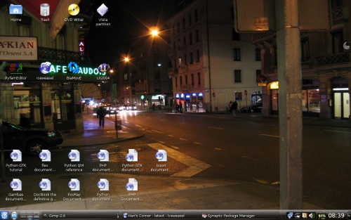
Yes, I changed the desktop defaults to make it a bit more familiar to a long time KDE 3.5 user. Personally I take objection to the "Vista-ization" of KDE and I almost ditched it in favour of Gnome, but then I have a lot of things tied to KDE on my system and removing it would mean I have to find the equivalent Gnome programs which would be a tedious and lengthy process.
Filed under:
Sports by
Hari
Posted on Sun, May 24, 2009 at 09:46 IST (last updated: Sun, May 24, 2009 @ 19:16 IST)

Well, this year's
IPL has ended on a disappointing note for the
Chennai Super Kings, crashing out in the semi-finals when pitted against a determined Bangalore Royal Challengers, when a lot more was expected of this team.
I attribute the reasons for their failure to the over-dependence on Matthew Hayden at the top of the order, the brittle middle order batting, the complete failure of the two all-rounders - Albie Morkel and Jacob Oram - especially with the bat, and the poor fielding performance giving away an extra 10-15 runs every match. Overall, even though Chennai won several games and got into the semi-finals, they never looked like a champion-material team. That they got as far as they did can be attributed to M.S.Dhoni's shrewd captaincy, Muttiah Muralitharan's terrific bowling in the middle overs and the devastating batting form of Matthew Hayden and Suresh Raina in the early stages of the tournament. The rest of the team simply didn't pull their weight when required to do so. In matches which CSK won, the opposition's performance was far below par, allowing the team comfortable wins and not really testing their resolve under pressure.
I think the T20 format has also shown that you cannot rely on all-rounders to deliver all the time and you need a strong bowling attack made up of quality bowlers, not just bits-and-pieces cricketers. Not playing Makhaya Ntini even once and persisting with an off-colour Jacob Oram who really did nothing for the team, proved costly in the end.
The team needs a big re-think before their campaign next season. Many of the non-performers need to be chucked out. Weak players like Laxmipathy Balaji need to be shown the door. Balaji, ever since his come-back from serious injury, has never looked anywhere near prepared for competitive league cricket and his buffet slow-medium bowling is just not enough to restrict big hitters in the opposition who treat him like a spinner who doesn't get any turn. The fielding also needs massive improvement, because the current bunch have looked extremely tardy on the field right throughout.
Overall, the Chennai Super Kings didn't really deserve their semi-final spot this time around. They got a place in because some of the other teams sucked more.
Filed under:
Internet and Blogging by
Hari
Posted on Sat, May 23, 2009 at 13:28 IST (last updated: Sat, May 23, 2009 @ 13:49 IST)
As you can see from the banners on top of my website, I've been running
Project Wonderful ads for around a week to ten days now. It looked a very neat concept in theory, but the reality is totally different as I've found out even within the short duration of running these ads.
I'm not going to explain in detail how the "infinite auction system" works, because you can read about it on their own site.
The idea, in theory, is that you set up ad boxes on your website at different locations, set a minimum amount for each of those spaces and watch as advertisers fall over each other to outbid one another to show their ads and make you money.
However, the reality is that, as a publisher you're forced to sell your ad space at a ridiculously low rate because of the gross disproportion between the number of publishers in the system who are desperate to go to any extent to get a few ads displaying on their website (for a couple of cents a day or even for free sometimes) and the number of advertisers who are actually willing to spend more than a few cents on advertising on your valuable web real estate. The cost-per-day concept is really great for people who are sick of waiting for clicks on their CPC ads, but frankly I don't think that this will work out to anything big unless the system is revamped and more money is brought into the system through decent commercial advertisers who actually have products to sell and can afford to spend more money on ad space. On a somewhat technical note, the Project Wonderful ad widget also seems to be totally out of tune with my real website traffic stats which is considerably higher than the graph displayed by their system.
Right now most of the advertisers seem to be bloggers, web-comic creators and small time authors or book publishers who don't really have a lot of money to put into advertising. It's also a fact that they also seem to be the biggest group of publishers in the system. In a nutshell, I have a vague idea that the same money in the system seems to be circulating around these ads without substantial investments from outside the system.
The other big issue with these advertisements is that the advertisers can cancel their ads at any time whatsoever (and they seem to do this most of the time within a few hours of putting their ads) and this way, you don't even earn a full-day's worth of advertising even if it's just one-tenth of a dollar. You can do your arithmetic and can easily understand that the nature of this kind of advertising benefits neither advertisers nor publishers. Advertisers don't run ads long enough to be effective on low-to-medium traffic sites (I doubt whether really high-traffic sites are the target audience of Project Wonderful) and the publishers earn in fractions of cents every time an ad is displayed for a couple of hours. I do wish that something is done about it by Project Wonderful. I've already written to them about it expressing my concerns.
On the positive side, the nature of the advertising is rather more pleasant (and artistic too, sometimes!) and less icky than the typical personal finances (credit management type) ads or make-money-online ads you see in other networks, the PW staff are very responsive in e-mails and extremely helpful in addressing any doubts you might have. Each e-mail is taken seriously and the staff actually read your mail in full and respond point-by-point to your queries or concerns as the case may be. Also their minimum payout is quite low ($10) and they do support the Paypal option, so international publishers can get their money rather more painlessly than waiting weeks for a mailed cheque. There is also a refreshing transparency and honesty about this kind of advertising that empowers publishers a lot more than the CPC model where a lot of factors are hidden and ambiguous both to advertisers and publishers and click-fraud can be rampant for higher-value ads.
Note that at the end of the day, I'm not going to recommend PW if you really want to make money through ads because they have quite a few issues to resolve and they will need to attract a larger pool of advertisers to get some kind of competition going. Until then, I doubt whether this model will be a serious threat to the big players in the online advertising industry.
However, I am going to give PW a fair trial before I either pull it off the site or consider it worthwhile.
It's fun to experiment with and quite an interesting way to discover interesting web comics if they're your cup of tea.
Filed under:
Tutorials and HOWTOs by
Hari
Posted on Fri, May 22, 2009 at 18:15 IST (last updated: Tue, May 15, 2012 @ 11:42 IST)
Here's a brief insight into how I prepare my webcomic, Boxi and Panjo and what the two different methods of creating a comic strip for online publishing can involve.
This is not a full-fledged tutorial on drawing or how to use the tools I've mentioned here, but merely to give an idea of the processing involved.
Boxi and Panjo - the fully digital technique

Boxi and Panjo started off as a fully digitally prepared comic strip and only in the latest one (not yet published, by the way) have I experimented with drawing on paper and scanning in the results). In a future HOWTO, I shall explain the more traditional pen-on-paper technique.
First, the tools used:
Hardware: I use an iBall WizardPen-based 5.5"x4" digital pen tablet with 1024 pressure levels - you can use any kind of digital tablet with pressure sensitivity
Software: GIMP 2.6+, OpenOffice.org Draw (for putting together the panels). Photoshop fans will have no problem following these steps
 Skills required:
 Drawing

, reasonable skill with digital pen-tablet, basic knowledge of using GIMP with layers
Method of drawing and preparation
- Create a sufficiently high-resolution blank image of say, size 1024x768 at 96 dpi or higher.
- Use the default background layer as a "rough-pencil" layer. Use the Pencil tool to draw basic shapes using different colours like blue and green.
- Create a new layer for the basic background layer. Draw the scenery in this layer. Use the "Paintbrush" tool with a thick brush (say 3 to 5 pixels) to draw nearby objects and a thin brush (say 1 to 3) to draw faraway scenery.
- Create a new transparent layer for each character in the panel. Hide the background layer created in the previous step and superimpose the character layer with the rough-pencil layer and "ink" the shapes to get the final character.
- Repeat above for other characters. Move characters to appropriate positions if necessary.
- Rough colour the finished scenery and characters using the fill tool. Use a higher "threshold" (say 25 to 30) to avoid visible jagged edges in the fill region.
- Apply the accents and shading by enabling pressure sensitivity coupled with opacity in brush tool. Use a sufficiently thick brush (say 20 to 30 pixels soft brush) to get smoother shadows and accents.
- Now create another set of layers for the second panel of the comic. Create a fresh pencil layer and background layer if needed, otherwise reuse the earlier background layer for the second panel.
- Repeat the steps above for colouring and save the image.
- Add a copyright text and signature as different layers. Position this correctly within the panel of your choice.
Creating the speech bubbles
- Use a text layer to add the text that characters speak above the other layers in the panel.
- Create a new layer for speech bubbles exclusively above the other layers in the panel and below the text layers.
- Use the rectangle selection tool and add a rounded corner radius to it say 25 or 30.
- Select a rectangle for the speech in the speech bubbles layer fully surrounding the text. Now choose "free select" tool and hold CTRL and add a little tail selection for pointing to the character.
- Fill the selection with black. Now the black text should be invisible.
- Shrink the selection by 3 to 5 pixels. Now in the modified selection, fill with white! Voila, your speech bubble is ready!
- Repeat for every speech bubble in the frame. Repeat this whole procedure for each panel by using more speech bubble layers.
Preparing for publishing
By this time, the comic is ready for publishing. Now export each panel of the comic by adjusting the visibility of the appropriate layers in the mega-XCF file you've now created. Use PNG format. PNG is preferred at this stage because it is a lossless format.
Now open the PNG files exported and scale as appropriate for web publishing, say 400x300 or lesser. Add border to the panel using the a 2 pixel black border. Save or export to a different format. Name these files as Frame1.png and Frame2.png (or Panel1.png or Panel2.png etc.)
Open up OpenOffice.org Draw or a similar drawing tool which can set up your frames as you desire. Import each panel into the drawing and position them accordingly. Add a title below or above your comic and export the page as PNG again.
Finally open the PNG file exported, use autocrop to remove surrounding white portions which got added during the OpenOffice.org export and save again, either as JPG or PNG. Do not use GIF as the compression is quite poor compared to PNG and the results aren't great either.
JPG format offers much, much better compression for a large number of colours but is fuzzier and can be very grainy for detailed images; PNG gives excellent image clarity and sharpness for line-drawings but the file size can be enormous for detailed high colour 24-bit images. If you use a very simple colour scheme in your comic, exporting as 8-bit PNG can give you great results in terms of quality and file size.
Experiment with this final export and choose the best and most appropriate format!
Upload, publish and you're finally done...

Filed under:
Boxi and Panjo comic by
Hari
Posted on Tue, May 19, 2009 at 17:52 IST (last updated: Tue, May 19, 2009 @ 17:52 IST)
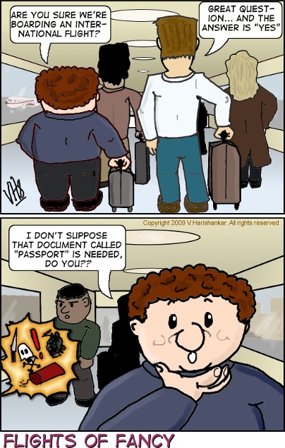
Children, please close your eyes in the second panel because lots of extremely vulgar swear words are picturized.

Filed under:
Humour and Nonsense by
Hari
Posted on Mon, May 18, 2009 at 16:52 IST (last updated: Mon, May 18, 2009 @ 18:27 IST)
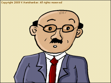 My Dear freinds, educcationed people and also non-educcationed peoples specialy
Wishing Hello all the Gentlemans and also to the Lady persons, (we are telling hello to the all, because we were not be able know u r wheather man-type or woman-type gendar)
INTRODUCTION US
kindly inform u we r the brand newly formed school for the English Langueages teaching for all the peoples irespectfully of thier caste colour creed relegion language etc. etc. (the IRESPECTFUL means we r not sayed U ARE LOWWER TYPE OR HI-ER TYPE PERSON) : BUT U are have this degeree Cerficeate of Any of the Colleges IS THE MUST u r eligable to entry our school as STUDENT (ok, if we tell ENTRY means, u r only thought permisson to come inside the Gates to the Campuss portion but this ENTRY is means u r permisson to ATTEND class s - so also give u these ID cards to knowing who is the student and who is the NOT student)
DO WHAT NOW?
u reqeuest joined this esteam organizasion today or tommorow (it is ok if u r joined ANY tommorows also mean many more days, but we are happy if u joined today before that lol [joke no problem u cn join all the times])
Pls u JOIN also pls ur freinds make JOIN by tell good-good things about school!! we will maked u the Great english languaeges Scholar person IMMEDEATLY BUT ONLY AFTER THESE 1 YEARS CLASSES ATTENDING (if u are not attend these properly all of the days, we r NOT garanteed RISULTs. OK, OK we r gived Sunday to be the Holeday so dont worry)
ENDING PARTS ALSO THE CONTACTS
Fees we will be discussed with u only in the School office rooms only but IT IS CHEAP MEANS LOW PRIZE/PRICE SO NO PROBLEM FOR U. Please dont get the angry NOW why we r not informming u this place. We r tell u y not to speaked about this fees business wise on the out side of the school. One OLD ENGLISH WISE MAN sayed in olden days THAT THERE IS ONLY THE TIME AND THE PLACE FOR ALL THE THINGS
Contact:
 Professor La. Voo. Chee. Packarasan, B.A. (English), M.A. (English), Ph.D. (Also TO THE English) (u tell watchman at Gate u r come for admisson and he will very happy be told u which number of the office room -- we r haveing these LAAAARGE campusses so u please not to get LOST!!)
Pages:
1
...
63
64
65
66
67
68
69
70
71
...
140
 Here's the obligatory screenshot:
 Yes, I changed the desktop defaults to make it a bit more familiar to a long time KDE 3.5 user. Personally I take objection to the "Vista-ization" of KDE and I almost ditched it in favour of Gnome, but then I have a lot of things tied to KDE on my system and removing it would mean I have to find the equivalent Gnome programs which would be a tedious and lengthy process.
  Well, this year's
  Boxi and Panjo started off as a fully digitally prepared comic strip and only in the latest one (not yet published, by the way) have I experimented with drawing on paper and scanning in the results). In a future HOWTO, I shall explain the more traditional pen-on-paper technique.
First, the tools used:
Hardware: I use an iBall WizardPen-based 5.5"x4" digital pen tablet with 1024 pressure levels - you can use any kind of digital tablet with pressure sensitivity
 , reasonable skill with digital pen-tablet, basic knowledge of using GIMP with layers
Method of drawing and preparation

 Children, please close your eyes in the second panel because lots of extremely vulgar swear words are picturized.
  My Dear freinds, educcationed people and also non-educcationed peoples specialy