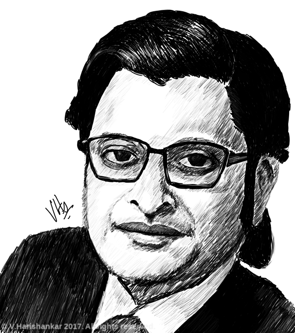
Portrait of Arnab Goswami. Painted using Krita with my XP-Pen Artist 10S.
Filed under:
Artwork/Portraits/Caricatures by
Hari
Posted on Sun, Dec 3, 2017 at 22:49 IST (last updated: Sun, Dec 3, 2017 @ 22:49 IST)

Portrait of Arnab Goswami. Painted using Krita with my XP-Pen Artist 10S.
Filed under:
Artwork/Portraits/Caricatures by
Hari
Posted on Thu, Nov 23, 2017 at 22:44 IST (last updated: Thu, Nov 23, 2017 @ 22:44 IST)
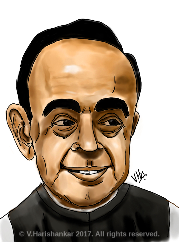
Caricature of Dr Subramanian Swamy. Painted using Krita with my XP-Pen Artist 10S.
Filed under:
Artwork/Portraits/Caricatures by
Hari
Posted on Mon, Nov 20, 2017 at 21:30 IST (last updated: Mon, Nov 20, 2017 @ 21:30 IST)
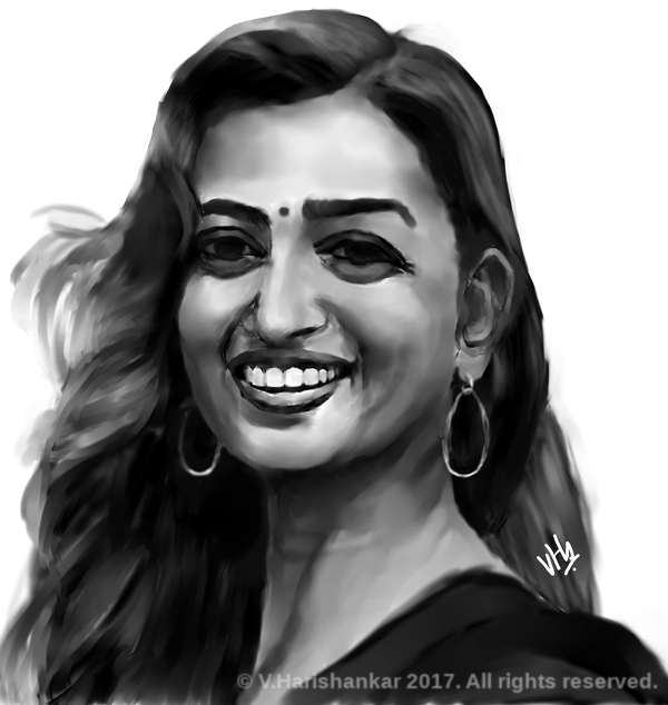
Portrait of actress Radhika Apte. Painted using Krita and MyPaint with my XP-Pen Artist 10S.
Filed under:
Artwork/Portraits/Caricatures by
Hari
Posted on Wed, Nov 15, 2017 at 21:24 IST (last updated: Wed, Nov 15, 2017 @ 21:25 IST)
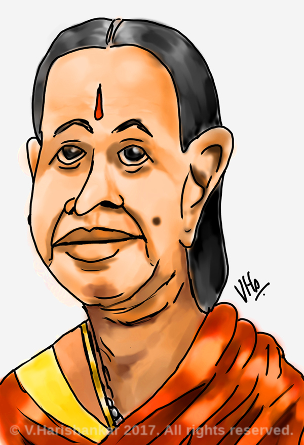
Cartoon Caricature of a "maami". Painted using Krita with my XP-Pen Artist 10S.
Filed under:
Artwork/Portraits/Caricatures by
Hari
Posted on Sun, Sep 17, 2017 at 21:58 IST (last updated: Sun, Sep 17, 2017 @ 21:58 IST)
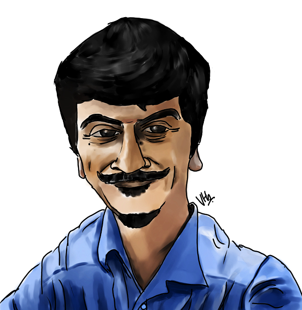
Another colleague. Painted using Krita with my XP-Pen Artist 10S.
Filed under:
Site management by
Hari
Posted on Tue, Aug 29, 2017 at 22:49 IST (last updated: Tue, Aug 29, 2017 @ 23:02 IST)
I've now made this website basically mobile-friendly, in the sense that it is now easy to browse using a mobile browser. I achieved this mostly by setting the viewport scaling to 1 and using CSS media queries to adjust the CSS wherever required for mobile friendly access. Though not perfect, this website is at least easily readable on a mobile browser now. For those curious as to how it can be achieved, you can view the CSS of this page and also the meta tag for viewport setting i.e.
<meta name="viewport" content="width=device-width,initial-scale=1.0" />
This line in the head of every page will ensure that the page does not "scale" as though it was a desktop width page to fit into a mobile browser. Further CSS media queries which are supported by most modern browsers allow you to easily change the CSS to suit smaller sized screens. A powerful combination which makes it simple to maintain a single website to serve on both desktops and mobiles.